
NASA’s newly released video of the earth has a strange hypnotic beauty that resembles the shifting sands of the desert or the psychedelic swirling colors of soap bubbles. But this video reveals an otherwise invisible threat caused by the short-term release of millions of years of carbon dioxide into our atmosphere.Hundreds of ground level CO2 monitoring stations across 66 countries have been used to measure carbon dioxide concentrations over the past century. These observations revealed that last year the average global CO2 concentration exceeded 400 parts per million for the first time in more than two million years– a time when giant camels roamed places as far north as Ellesmere Island in the high Canadian arctic.
We know much about the long term history of carbon dioxide from ice core samples and a combination of atmospheric sampling and calculations based on known levels of industrial carbon consumption. For example, any high school chemistry text book will tell you that that approximately 2.6 tons of CO2 is produced for every ton of coal burned. The world coal association estimates that approximately 7.6 billion tons of coal are consumed every year, so ignoring oil, gas and other significant CO2 producers, humans release approximately 20 billion tones of carbon dioxide into our atmosphere every year.
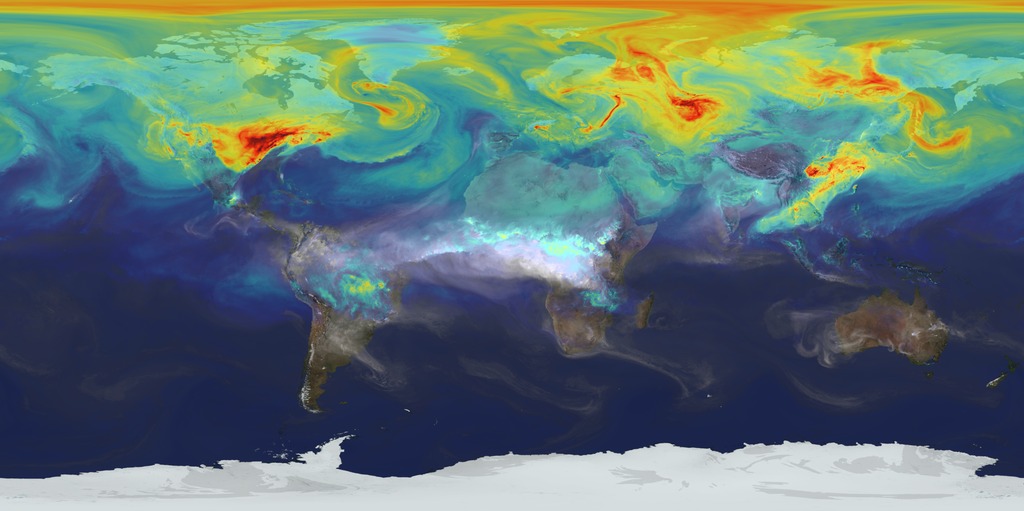
An optimist might assume that nature quietly absorbs all of this CO2 without any harmful side-effects such as ocean acidification. But the scientists at NASA’s Goddard research center don’t want to bet our future on polyanna assumptions. Instead, they are using a supercomputer model called GOES-5. Similar computational models are used to predict the behavior of hurricanes and other weather patterns. This particular GOES-5 model is designed to calculate where this carbon dioxide goes. It reveals the release, sequestering and movement patterns of this otherwise invisible gas. I’d suggest watching this video first with the sound turned down and knowing only that redder colors represent higher CO2 concentrations.
[youtube]https://www.youtube.com/watch?v=x1SgmFa0r04[/youtube]
Now that you’ve seen it, watch it again with narration and look for the following:
- High concentrations of CO2 from northern hemisphere populations in Asia, Europe and North America but relatively little CO2 in the southern hemisphere.
- Carbon Monoxide (CO), represented in shades of blue and gray, is released from fires in Africa and South America.
- As northern hemisphere spring moves into summer, plants remove some of the highest concentrations of CO2.
- Carbon dioxide follows weather patterns similar to moisture, concentrating in swirling patterns which move from west to east.
- Carbon dioxide moved from population centers to concentrate in the high arctic where there are few trees to absorb it.
This visualization is a tool to help people understand the scope of the world’s invisible carbon dioxide problem. The complexity of CO2 flow demonstrates how difficult it is to measure this simple parameter. No doubt, part of the money each of us spend on fossil fuels is redirected to marketing propaganda designed to assure the status status-quo. As the northern hemisphere enters another high CO2 season, NASA’s Orbiting Carbon Observatory (OCO2) satellite will soon provide real-time readings of global CO2 that we can compare with these supercomputer models. In the end, science will reveal a truth that won’t bend to politics, slick marketing or wishful thinking.

Author: Brian Nitz
Brian remembers when a single tear dredged up a nation's guilt. The tear belonged to an Italian-American actor known as Iron-Eyes Cody, the guilt was displaced from centuries of Native American mistreatment and redirected into a new environmental awareness. A 10-year-old Brian wondered, 'What are they... No, what are we doing to this country?' From a family of engineers, farmers and tinkerers Brian's father was a physics teacher. He remembers the day his father drove up to watch a coal power plant's new scrubbers turn smoke from dirty grey-back to steamy white. Surely technology would solve every problem. But then he noticed that breathing was difficult when the wind blew a certain way. While sailing, he often saw a yellow-brown line on the horizon. The stars were beginning to disappear. Gas mileage peaked when Reagan was still president. Solar panels installed in the 1970s were torn from roofs as they were no longer cost-effective to maintain. Racism, public policy and low oil prices transformed suburban life and cities began to sprawl out and absorb farmland. Brian only began to understand the root causes of "doughnut cities" when he moved to Ireland in 2001 and watched history repeat itself. Brian doesn't...


This article so upset me that I sent it to a scientist & he wrote:
full of unsubstantiated assumptions, this is not scientific, it is a use of scientific terminology to enhance the credibility of the authors predetermined assertions. It becomes more evident when you see the raw data in the NASA Earth Observatory, it turns out to be far more complicated. this is directly from NASA’s report
A Closer Look at Carbon Dioxide
November 17, 2014
A new simulation of carbon dioxide in Earth’s atmosphere provides an ultra-high-resolution look at how the key greenhouse gas moves around the globe and fluctuates in volume throughout the year. These three close-up views show how local geography affects the transport of carbon dioxide in the atmosphere. The visualization is a product of a NASA computer model called GEOS-5, created by scientists with the Global Modeling and Assimilation Office at NASA’s Goddard Space Flight Center, Greenbelt, Maryland. This particular simulation has about 64 times greater resolution than most global climate models. In particular, the simulation is called a Nature Run. In this kind of “simulation”, real data on emissions and atmospheric conditions is ingested by the model, which is then left to run on its own to simulate the behaviour of Earth’s atmosphere for a two-year period – in this case, May 2005 to June 2007.
The colors represent a range of carbon dioxide concentrations, from 375 (dark blue) to 395 (light purple) parts per million. The red represents about 385 parts per million. White plumes represent carbon monoxide emissions.
North American emissions
One of the visually striking things about this animation is how much local weather patterns affect carbon dioxide in the atmosphere. In this close-up view of North America – from Feb. 1, 2006 to Mar. 1, 2006 in the simulation – you can see the major emissions sources in the U.S. Midwest and along the East Coast. As the carbon dioxide is emitted, westerly winds created by the warm currents of the Gulf Stream carry the greenhouse gas “eastward” over the Atlantic Ocean. Not northward to the Arctic
Asia and the Himalayas
In this view of Asia, two things stand out: the major emissions sources of the industrialized Asian countries, and the natural barrier of the Himalayas. As carbon dioxide concentrations swirl and move eastward, the Himalayas – the crescent-shaped mountain range just north of India – redirect winds. This video shows Feb. 1, 2006 to Mar. 1, 2006 from the simulation.
African fires
While the previous movies showed regions of major man-made emissions, this close-up shows the emission of carbon dioxide – and carbon monoxide, the plumes of white – from fires in southern Africa. This video shows Aug. 1, 2006 to Sept. 1, 2006, a period of seasonal burning in this region.
Dear JTR,
I totally agree with you. That is why I am – as an entrepreneur – one of the the promotors of the economy of enough as an alternative of the existing world economy who is ‘bankrupt’. So? I would love to create a wordlwide chain of professional ecological villages (coops of about 25.000 inhabitants each) as serious inspiring examples of this new economy. In these villages people live an dwork together with respect for eachother, animals, the environment and eachothers belongings. For these villages I focus on Holland and Israël (Negev).
P.S. The information (Dutch/English) on my website needs a thorough update.
Men are driven by their instinct to grow more powerful to conquer the symbols of death around them. But planet Earth is NOT growing, instead it is slowly shrining with every volcano, earthquake and ton of coal and oil dug and pumped up out of the ground. This plus the massive amounts of pollution dumped every day in the land water and air, spells ecocide and extinction for mankind, unless he can agree to safely recycle 100% and gently educe his population with family planning education. The climate is already changing, so time has run out. We need to change now, today and every day, if we expect to survive as a species.